
About

A small studio with an editor's bias.

I work with businesses that have something real to say, but whose site has picked up too many layers. The job is to make the useful thing easier to see.

Website design work in progress on a studio desk.

Point of view

Taste is useful when it makes the business easier to read.

A finished website should help people understand the offer, the reason to trust it, the texture of working together, and the next step.

That means the unglamorous choices carry weight: the first headline, the proof beside it, the form label, the mobile crop, the redirect no one sees unless it breaks.

Directions in practice

The point of view has to hold in more than one kind of room.

These self-initiated concepts show how the same preference for clarity changes with the stakes: a considered stay and a high-trust advisory practice.

Stillwater and Pine lake-house website concept preview.

Hospitality / retreat

Stillwater & Pine

A private-stay concept where the atmosphere is warm, but choosing a house and planning the trip stay straightforward.

Decision shown: make the booking path feel considered without interrupting the sense of place.

Open concept
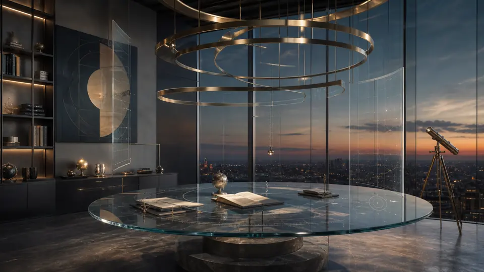
Aster Vale CPA website concept preview.

Professional service / advisory

Aster Vale CPA

A financial-advisory concept that turns complex work into a visible operating rhythm for owner-led companies.

Decision shown: use authority, structure, and useful cues instead of generic corporate polish.

Open concept

Beliefs

Restraint is not emptiness. It is pressure.

The site can be quiet because the decisions underneath it are not vague.

Plain language is not plain thinking.

The copy should be direct enough to understand and specific enough to feel owned.

Space should make the page braver.

If a claim is strong, it can stand with fewer neighbors. If it is weak, decoration will not save it.

The working parts count.

Forms, phones, focus states, metadata, and launch checks are part of the impression.

Best fit

A good fit when the business is stronger than the page.

Fifth & Form is built for people who want one thoughtful collaborator across message, design, and build.

You have proof, taste, or a clear offer, but the site is making visitors assemble the argument themselves.

You want the page to feel specific without becoming precious.

You would rather make fewer, sharper decisions than keep adding explanations.

Contact

If that sounds like the kind of attention your site needs, send a note.

Start with what the site needs to make clearer. We can sort the rest from there.

Start a Site Review